Branding consistency plays a major role in the success of a businesses.
Ensuring everything from your email newsletters to your business cards look and feel like they come from your company is vital to help customers (and potential new customers) recognise – and remember – your brand.
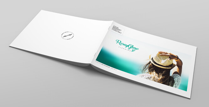
To do this, you will need a Visual branding identity guidelines document. This document will become your guidebook for creating any new images for your website, physical documents, or other communication for your clients.
What is a Visual branding identity guidelines document?
A Visual branding identity guideline is a brief document that outlines the visual identity of your brand. It defines the basic rules that need to be applied when using your brand in any media; print or digital.
A visual branding identity guideline will describe:
- Logo design (variations and usage)
- Colour palette
- Typography
- Imagery style
This document is designed so that no matter who has their hands on your brand, they will have the basic know-how to ensure consistency, whether that is you or other members of your team, another graphic designer or web developer, a printer, a sign-writer and so on. It will ensure you use the correct colours and fonts, and apply your various elements the way it was intended.
1. Logo design (variations and usage)
A logo is a simple graphic representation of an organisation.
The logo is the first visible emblem of the company or service, identifying a company in its simplest form, via a symbol, mark or icon.
Creating a logo might be the first step in creating your Brand, however a single logo does not build a brand. A logo needs support from strategic visual elements to capture people’s minds and stay there for a long time.
That’s where Brand Guidelines come into play.
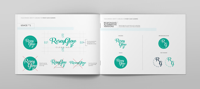
The Guidelines show exactly what your logo design is, how it’s built, and if it has any variations you can use.
For example, see my clients' Rosey Glow Cleaning logo design below. They have 5 logo design variations: one primary, one stacked, one badge, one icon, one watermark.
The primary logo must be used in most instances. The other versions provide an alternative to use depending on the material, for example, the icon version could be used as their Instagram icon to make full use of the small image-area.
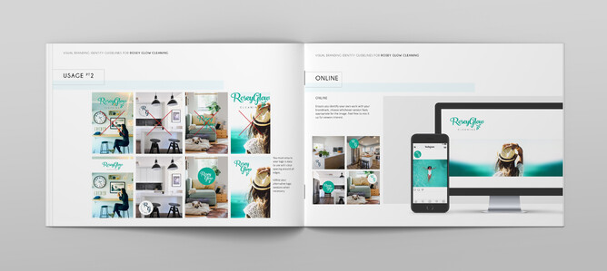
Your brand guidelines will also define the basic rules on how to use your logo, for example how much clear space needs to show around your logo, the use of backgrounds, etc. In order to keep them consistent and professional there should be some established restrictions. Without them, there may be a risk of distortions or changes.
2. Colour palette
The colours of your brand are the backbone of your visual identity, and are usually the most quickly recognisable element of your brand.
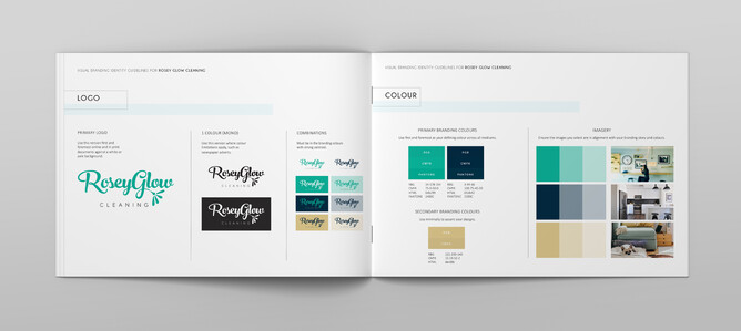
I recommend using three to five colours, with a chosen primary or main colour. Depending on your brand there will be a number of combinations and uses of the palettes.
A key element of your guidelines will be showing the exact codes of your colours for different uses, specifically:
- RGB and HTML: used for web and digital materials.
- Pantone and CMYK: used for print materials.
A Visual branding identity guideline ensures that your brand message stays consistent to your audience and enhances your brand positioning.
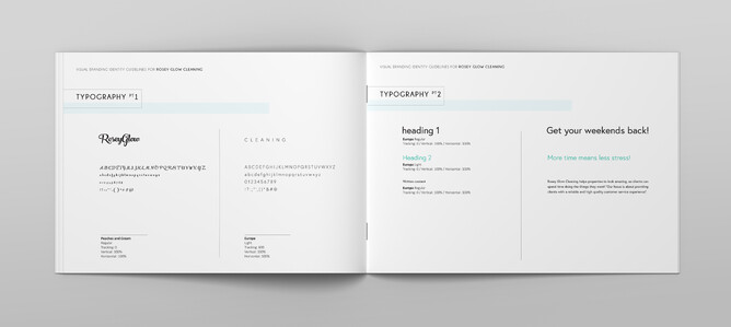
3. Typography
Just like the colour palette, the typography you use also helps to represent the values of your brand. Your brand guidelines will specify the name of the fonts used in your logo. I recommend sticking to these fonts for all your branding otherwise you risk diluting your brand and confusing your audience.
4. Imagery style
Depending on your brand needs, the images you use might be more dynamic than your colours and fonts, which are strictly defined.
Especially when working on social media posts, you might use different photos for different occasions, however this doesn’t mean that you can use any photo. Your Visual branding identity guidelines will include recommended image styles to keep your visual identity consistent.
Summary…
Having Visual branding identity guidelines will help you keep visual consistency throughout your brand and display true professionalism to your audience and dream clients.
- It will make it easier when creating new materials for your brand.
- Consistency is key to avoid delivering different representation of your brand which can confuse your audience.
Designerbloom has worked with many different kinds of businesses, putting together effective guideline documents that help clients build a strong brand position and presence. If you need help with your brand make sure to get in touch!
