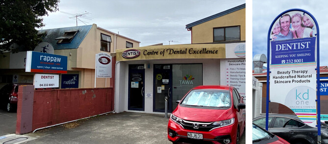
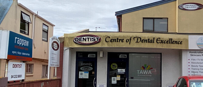
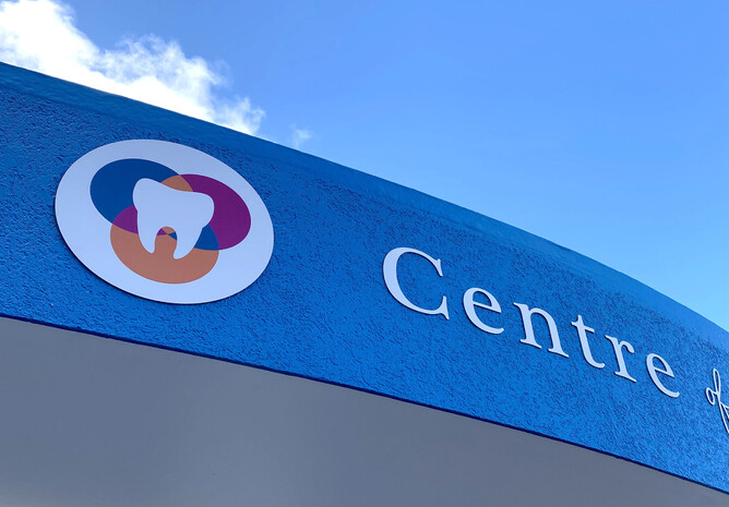
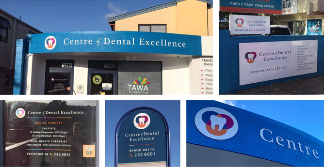
It was a case of poor appearance for Centre of Dental Excellence… which is not the message you want when trying to promote and help people look their best – both in looks and health.
In early 2021 Jaideep and Sonali – proud owners of the Centre Of Dental Excellence in Tawa, Wellington (https://www.dental.net.nz/) - connected with Jo from Ctrl+P (https://ctrlpforprint.co.nz/) about printing and replacing their signage. Jo contacted me about designing the rebrand; “The name is staying but they’d like to refresh the colours and present a more clean and modern look – I know you’ll be able to work with them to create the right look.”
Sonali, Practice Manager, followed up with “As discussed with Jo, we felt it would be good if you could come and see us at the practice to see what is required and advise us accordingly.”
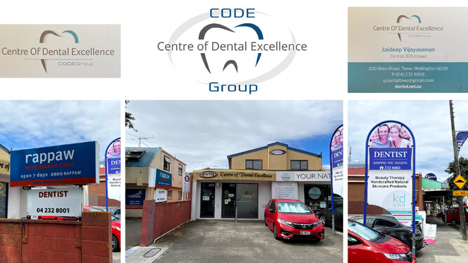
Upon arrival I noticed the existing signage was incredibly dated and old, it didn’t match or have an aligned brand and the building itself needed a good clean. It was not an inviting place from the outside and did not represent the high quality dental services that Jaideep and his team offered.
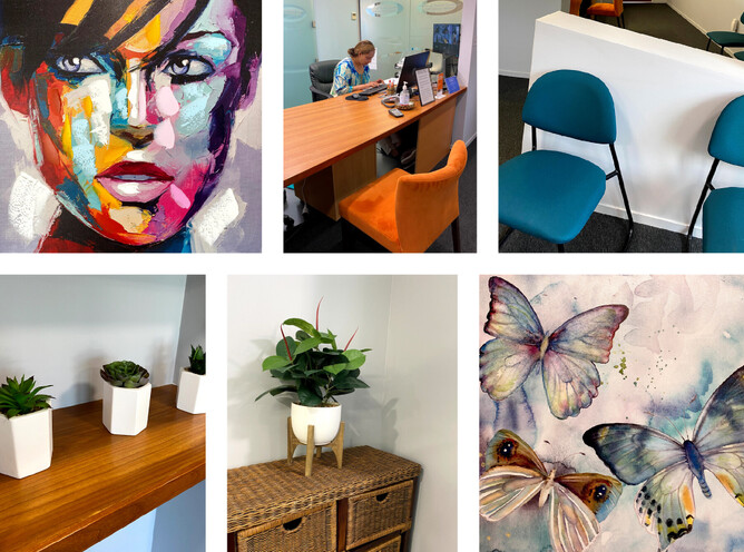
From the inside it was a different story. The practice was bright, clean, and energetic. Filled with vibrant and colourful seating and artwork, paired with calming and delicate furnishings and plants. Both Sonali and Jaideep emitted a vibrant, happy, warm and colourful welcome – I really wanted this element of their personalities to shine and come across in their branding.
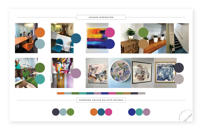
Part of the Designerbloom brand creation process includes looking at other dental practices in the area, where I noticed the majority followed a similar colour scheme, so I wanted to create something different and unique for Centre Of Dental Excellence.
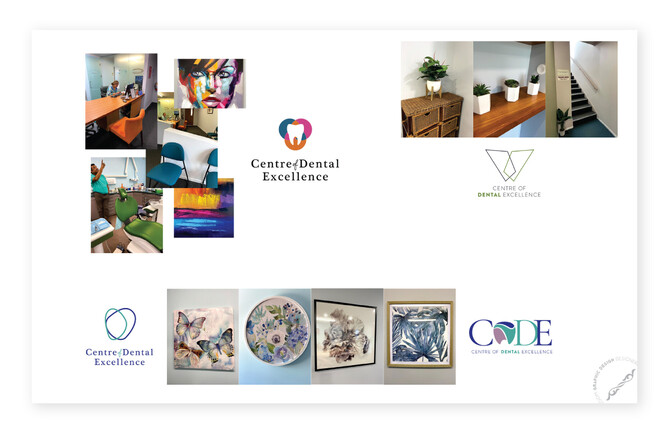
Two pieces of art in the practice really stood out to me and sparked my vision for the rebrand. I pulled together a colour palette from this inspiration, and created some logo possibilities.
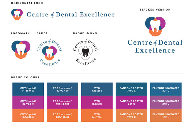
I supplied a variety of logo options, from professional and sophisticated, to welcoming and approachable. We worked together through feedback and alterations to create the final look. With the final colour pallet supplied with the branding guidelines I also included a Resene Colour Paint recommendation for the shopfront – choosing Resene Bahama Blue to complement the branding colours.
Once the signage was all installed Jo (print broker) posted this to her social media; ”This has got to be one of the best before and afters! We produced everything right down to the custom open closed sign as well as arranging the installation so it was a smooth and easy upgrade for the clients. Now they have given their building a full facelift it better reflects their business. This job posed a few complex issues due to the existing signage but over at Ctrl+P I love a challenge and how great is this end result!”
Feedback from Jaideep was; “We love it, and have received great feedback on how fantastic it looks!”
