A brilliant photographer isn't enough. Find out why...
There are so many talented photographers out there. You may have fallen in love with the images on their social accounts, or they've taken great family images your friends, or a cute baby, or they took your wedding photos and you think they're the greatest – and I bet they are! I follow many photographers and I am mesmerised by their talents and great eye.
However, taking images for websites is a different ballgame. Here I will explain why.
Your website images need room to breath!
Images for websites are a lot different than images for your wall.
When having a photoshoot intended for your walls or picture frames, cropping is a huge part of the artistic process. Close-up baby faces, pets, a lovers embrace... they all look wonderful when cropped correctly.
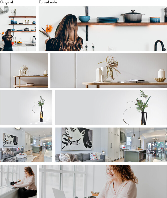
BUT ≈ if you place a cropped image on your website I can assure you that heads will be missing and people will be cut in half! Websites are like elastic – they need to be adaptable for viewing on an extremely large screen (or even projector screen) but also on the smallest of mobiles. This means the images you use need a lot of space around them to adapt for their different uses.
Wide images are important!
Most websites utilise the full screen width for full visual impact. The best way to have impactful images is to ensure they are very wide, but not too high (you don't want the entire screen to be all image (ok sometimes you do, but not every image!).
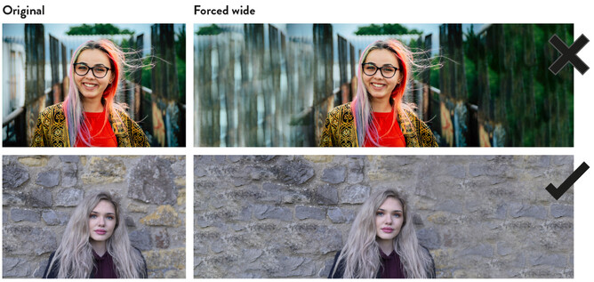
Sometimes it's not possible for your photographer to take a wide shot, so a good way around this is to make sure what's behind you is easy to photoshop into being wide.
Below is an example of this, the top one shows that the busy background does not work well, as it is obviously photoshopped!
The second image is better – it works because the brick wall is even, and the photoshopping isn't obvious.
Choose your backgrounds wisely!
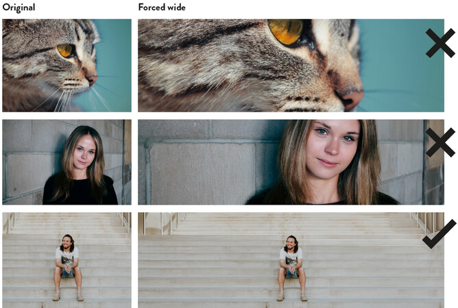
Below is another example where close up images are not ideal for website. The lovely cat becomes too cropped and because there's no breathing room around the original photo it makes photoshopping in ears too difficult. The same goes for the angled brick wall.
The man on the steps works well because the steps are very evenly coloured, which means when they're photoshopped wider it's almost impossible to tell it's not real.
Brand photoshoot - 10 steps to getting the most out of yours
Now that you know more about what images will work best for your website, check out the below Blog about choosing the right branding photographer for your business.
