A brand identity consists of so much more than one logo. Here I will explain what logo variations are, why you ideally should have them, and how to use them in your business.
Simply put, logo variations are modified versions of your main logo.
They are very similar to each other, but flexible to use so you don’t have or stretch or squeeze your logo in the space available. Having multiple logo variations ensures your branding is consistent across all design collateral and online platforms. Each logo variation is used in different ways.
What logo variations should I have?
Depending on who you decide to work with on your branding, the types of logos you receive will differ.
Here at Designerbloom I include a full suite of logo variations for each client – ensuring they have a complete cohesive brand identity. Please keep in mind that a logo in itself is not a brand.
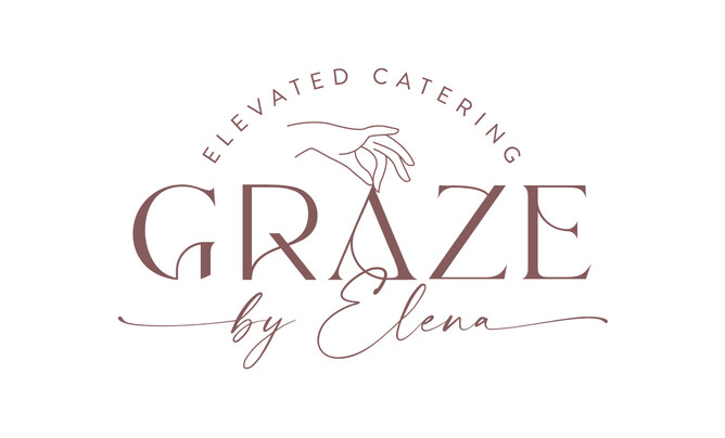
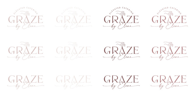
To help explain what you should ideally have I will be referencing one of my branding projects as an example; Graze By Elena.
Primary logo
This is your main logo. The logo to ideally be used where possible, such as website headers, Facebook banner, signage, business cards, brochures, and leaflets.
Your primary logo is the most complex of your logo variations. It will often contain the text of your brand, the icon/illustration, and tagline or year of establishment.
Secondary logo
Your secondary logo (also referred to as alternate logo) is a more stripped back version of your primary logo. This version of your logo is a little tighter, narrower or compact, allowing you to use it in a place where there isn’t much space, or you wish to keep the branding looking clean and simple.
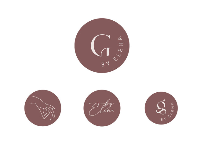
Submark
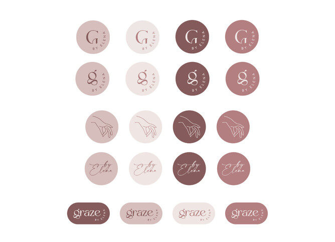
Your submark may still contain your full business name, but typically it will contain only the initials or the brand icon. Submarks are often smaller and tend to be circular or square which makes them ideal for places where a primary or secondary logo wouldn’t fit very well, such as your Instagram profile icon, website footer, Pinterest and blog graphics, stickers, presentation slides, or as a watermark.
Favicon
A favicon the very small icon in your web browser tab, before the domain name of your website. A favicon needs to be very simple and minimal as it is so incredible small. It will often contain only the brand icon/ illustration or initials.
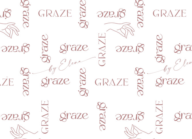
Brand elements
The requirement for brand elements really depends on the business. Some brands may opt for additional submarks or taglines, icons or illustrations, patterns or stripped down versions of their logo. I only provide brand elements if specifically requested, and sometimes they incur an additional design investment.
What else should you have?
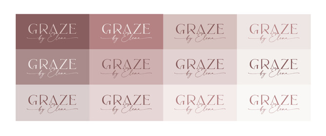
In addition, it’s also important to have colour variations of all your logos. During my design process, I work with my clients to develop one strong primary logo, and then create additional variations depending on my client’s needs.
Does your current brand have logo variations?
Logo variations will give your brand a consistent look both in print and online. I offer a Tidy-Up Logo package where I can take your current logo and create you a cohesive collection of your very own, without needing to go down the full re-brand route.
Need some advice?
I hope this post helped you understand what logo variations are, why you ideally need them, and how to use them in your business. If you’d like some further advice on creating logo variations for your own brand please get in touch.
