From Instagram to Blog!
I initially created a collection of graphics for an Instagram post during the beginning of the Covid-19 pandemic; "With unpredictable finances during this time I would like to offer some tips for DIY branding! This first tip is about using handwritten fonts for your social media tiles. I hope these tips come in handy for you!" – The post ended up being super helpful to those who saw it, so I have decided to turn it into this Blog.
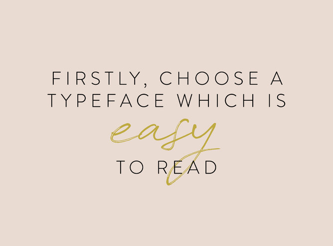
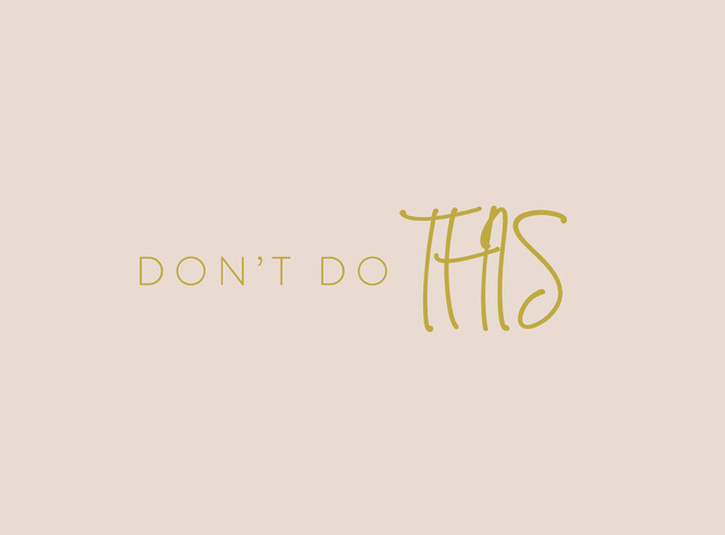
This one might seem obvious – but I've come across so many handwritten fonts where I find myself looking sideways trying desperately to figure out what it says! Don't be that person who makes hard work for your clients/followers, they're likely to just scroll on!
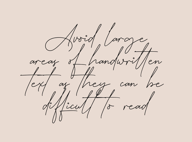
Again, it's just making it difficult for your followers, we all want to speed read when scrolling and move on to the next thing... so let's keep it simple!
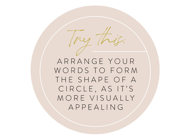
It's so appealing to see isn't it! Following this circle method will work wonders for the aesthetics of your graphics!
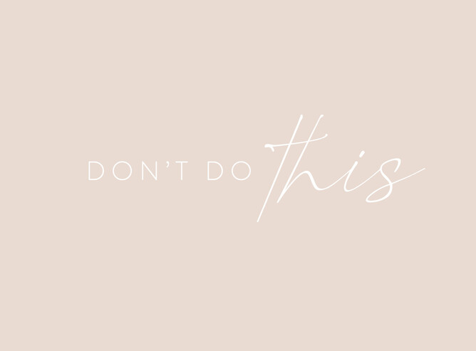
Use colours in high contrast to each other – many people struggle to read white on light coloured backgrounds. One trick is to imagine the image converted to black and white – if it's got little contrast it's just making hard to see, and again you risk your viewers moving on quickly to the next thing.
Stick to lowercase letters when using handwritten fonts – it looks kinda ugly, and again makes it harder to read!
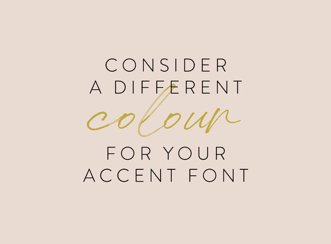
This isn't a must, but it certainly helps when you want to bring out a 'pop' word.
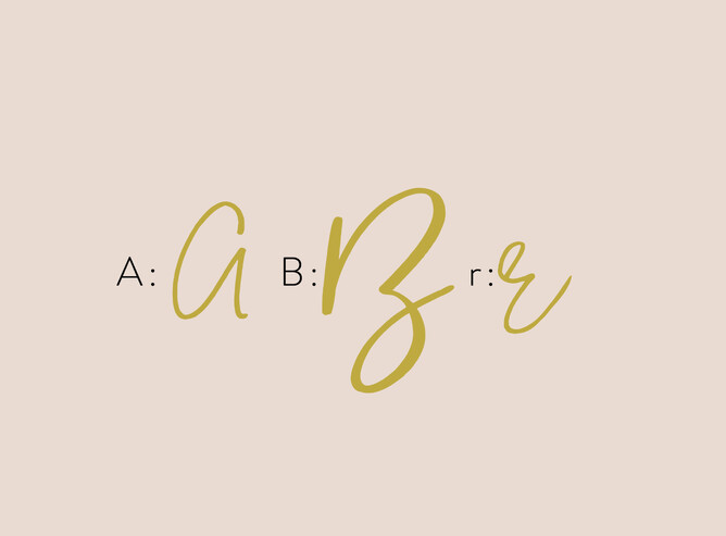
When choosing a handwritten font for your branding, be mindful of the letter formation, some don’t work very well... like the above!
When you choose to add handwritten fonts to your branding you need to consider if it's matching your mission and values, because you don't want to keep changing the fonts you use. Be consistent with your marketing, and be careful your branding doesn’t look amateur due to poor font choice.
If you're confused about which font to choose for your branding, or you'd like help setting up templates for social media graphics, I can work with you on a platform of your preference* to ensure all your branding is consistent. Get in touch and we can chat!
*Canva/ Photoshop
